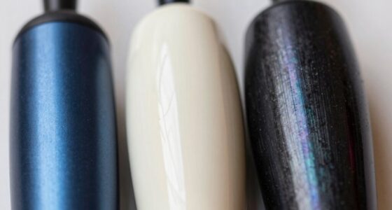

When working with neutrals, consider whether you want a warm or cool foundation. Warm neutrals, like beige and taupe, create cozy, inviting spaces, while cool neutrals, such as gray or greige, evoke calm and sophistication. Your choice affects the mood and style—warm tones energize, cool tones soothe. Pair them with textures and materials to enhance their effects. Keep exploring how to balance and combine these neutrals for the perfect look.
Key Takeaways
- Warm neutrals create cozy, inviting spaces with yellow, red, or orange undertones, while cool neutrals evoke calm and sophistication with blue, green, or violet undertones.
- Pair warm neutrals with earthy textures like wood and leather; combine cool neutrals with sleek materials such as marble and chrome for best results.
- Use contrasting warm and cool neutrals to add depth and interest without overwhelming the space.
- Incorporate textured fabrics and reflective surfaces to enhance the warmth or tranquility of your neutral palette.
- Understanding undertones helps in selecting harmonious color combinations and achieving balanced, stylish interiors.
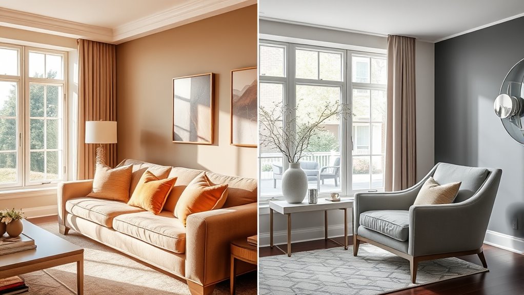
Neutrals are the foundation of versatile and timeless design, but understanding the difference between warm and cool tones can make a big impact on your color choices. When working with neutrals, you’ll want to contemplate how they interact through color pairing and texture combinations. These elements are essential for creating balanced, cohesive spaces that reflect your style. Warm neutrals, such as beige, taupe, and soft browns, evoke comfort and invite coziness. They tend to have undertones of yellow, red, or orange, which can make a room feel inviting and lively. Conversely, cool neutrals like gray, taupe with bluish undertones, and greige bring a calm, sophisticated vibe. They lean toward blue, green, or violet undertones, making spaces feel more tranquil and modern.
Warm neutrals create cozy, inviting spaces, while cool neutrals evoke calm, modern sophistication.
When pairing colors, think about how warm and cool neutrals can complement or contrast each other. For example, combining a warm beige with a cool gray can create visual interest without overwhelming the senses. This kind of contrast enhances depth and dimension, especially when you pay attention to texture combinations. For instance, pairing a plush, velvety fabric with a sleek, matte surface adds tactile richness and visual balance. If you choose warm neutrals for your walls, consider layering with textured materials like woven baskets, linen curtains, or a shaggy rug to emphasize warmth. On the other hand, cool neutrals work beautifully with smooth, reflective surfaces like glass or polished metal, which can amplify the calming effect. Incorporating different textures keeps the space engaging, preventing the palette from feeling flat or monotonous.
Your choice of neutrals should also influence your accent pieces and furniture. Warm neutrals pair well with earthy, organic textures—think wood, rattan, or leather—creating a cozy, inviting ambiance. Cool neutrals, on the other hand, shine when paired with sleek, modern materials like chrome, marble, or acrylic. These combinations reinforce a contemporary aesthetic and elevate the overall sophistication of your design. Remember, mixing textures with your chosen neutrals isn’t just about visual appeal; it’s about engaging the sense of touch and adding layers of complexity. Whether you’re selecting a soft, knitted throw or a glossy ceramic vase, these elements help your neutral palette come alive. Additionally, understanding color undertones allows for more precise pairing and a more harmonious overall look.
Ultimately, understanding the nuances of warm and cool neutrals empowers you to craft spaces that feel intentional and harmonious. By thoughtfully considering color pairing and texture combinations, you can blend warmth and coolness seamlessly, resulting in a balanced environment that’s both inviting and stylish.
Frequently Asked Questions
How Do I Identify if My Space Suits Warm or Cool Neutrals?
To identify if your space suits warm or cool neutrals, start by examining the color temperature; warm neutrals have yellow or golden undertones, while cool neutrals lean toward blue or gray undertones. Hold different fabrics or paint swatches next to your skin or furniture to see which shades harmonize better. Undertone identification helps you choose neutrals that complement your space, making it feel inviting and balanced.
Can Warm and Cool Neutrals Be Used Together in One Room?
Yes, you can use warm and cool neutrals together in one room. To make it work, use color mixing and contrast techniques to create harmony. For example, pair warm beige with cool gray, and add accents that tie the two together. Balance is key, so distribute warm and cool tones thoughtfully, ensuring they complement each other rather than clash. This approach creates a dynamic, inviting space.
What Accessories Best Complement Warm Neutrals?
Looking to enhance warm neutrals? Don’t you think accessories with complementary color schemes work best? Rich terracotta, deep gold, or earthy greens create a cozy, inviting feel. Incorporate textural accents like woven baskets, plush throws, or wooden frames to add depth. These elements highlight the warmth and add visual interest, making your space feel balanced and harmonious. What better way to celebrate warm neutrals than with thoughtfully chosen accessories?
Are There Specific Lighting Considerations for Cool Neutrals?
Yes, there are specific lighting considerations for cool neutrals. You should focus on lighting effects that enhance their crispness, like using bulbs with a higher color temperature, around 4000K to 5000K. This makes the cool tones pop and keeps the space feeling bright and fresh. Avoid overly warm lighting, as it can soften or distort the cool hues, so choose your fixtures carefully to maintain the intended cool ambiance.
How Do Neutrals Influence the Overall Mood of a Room?
Neutrals are like a canvas that sets the emotional tone of your space. They influence the mood through color psychology, making rooms feel calm, sophisticated, or inviting. Warm neutrals evoke coziness and energy, while cool neutrals create serenity and clarity. Your choice impacts the emotional impact, helping you craft an environment that reflects your desired ambiance. So, pick neutrals thoughtfully—they’re the silent architects of your space’s mood.
Conclusion
By understanding warm and cool neutrals, you can effortlessly create the mood you want. For example, imagine choosing warm beige in a cozy living room to invite relaxation, or cool gray in a sleek office for focus. When you mix neutrals thoughtfully, your space becomes a reflection of your style. So, experiment with these basics, and let your personality shine through your color choices—your perfect neutral palette is just a decision away.